
Navigation
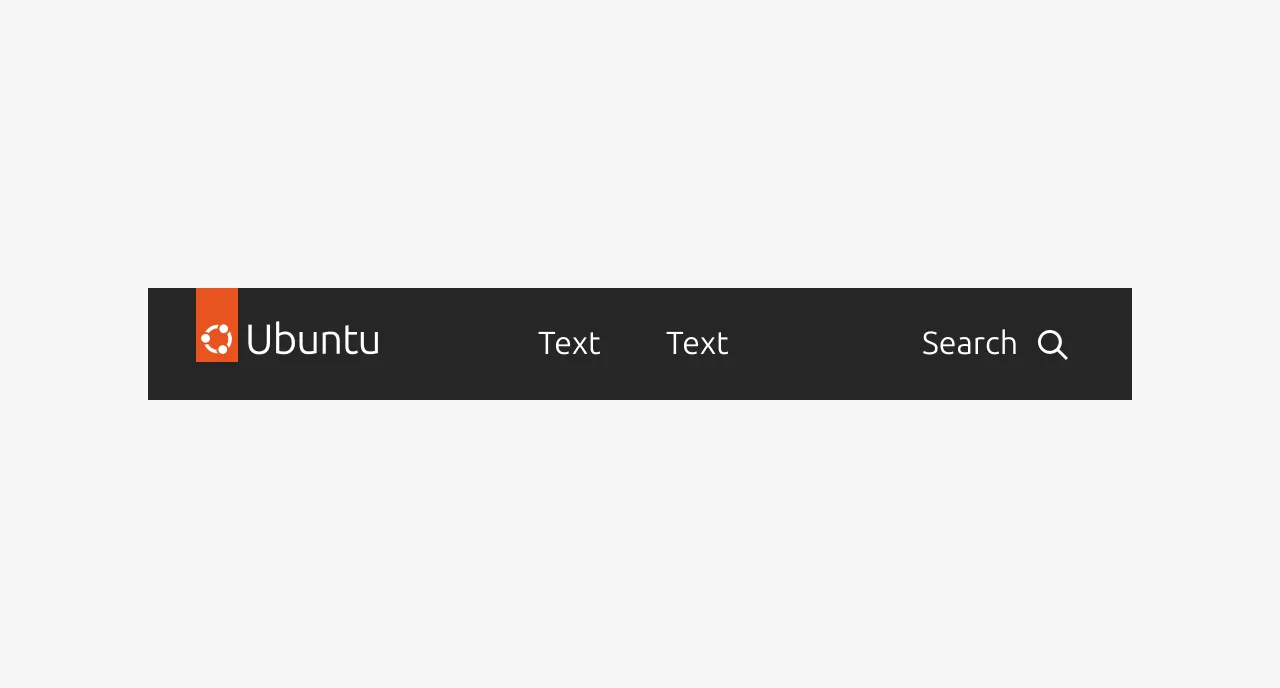
Navigation is a complex component that provides persistent, site-wide navigation for websites and documentation properties. It appears at the top of every page and gives users a consistent, predictable way to move between the main areas of a site.
Navigation is not a general-purpose menu or link container. It is specifically for primary site navigation - the top-level wayfinding that remains the same on every page. It should not be confused with in-page navigation (such as anchor links or table of contents), sidebar navigation used in applications, or breadcrumbs that show location within a hierarchy. Those serve different purposes. Navigation answers the question "where can I go on this site?", not "where am I within this page?" or "how did I get here?".
Anatomy
Usage
The Navigation component provides persistent, site-wide navigation for sites and documentation. It maintains consistent items, order, and placement across all pages. Navigation is a cornerstone of the user experience and should not change from page to page. The same items should appear in the same order and the same position on every page. Users rely on it being predictable.
When to use
- As the primary navigation for a site or documentation property
When not to use
- Do not use Navigation for actions. Navigation items should only navigate, not trigger actions like opening a modal or submitting a form. Buttons may appear in the navigation (for example, a contact us button), but these are exceptions and must be approved as snowflakes.
- Do not place external links in Navigation. Navigation should only link within its own domain. If an external link is necessary, mark it visually as external and use the link hover effect rather than the navigation hover effect.
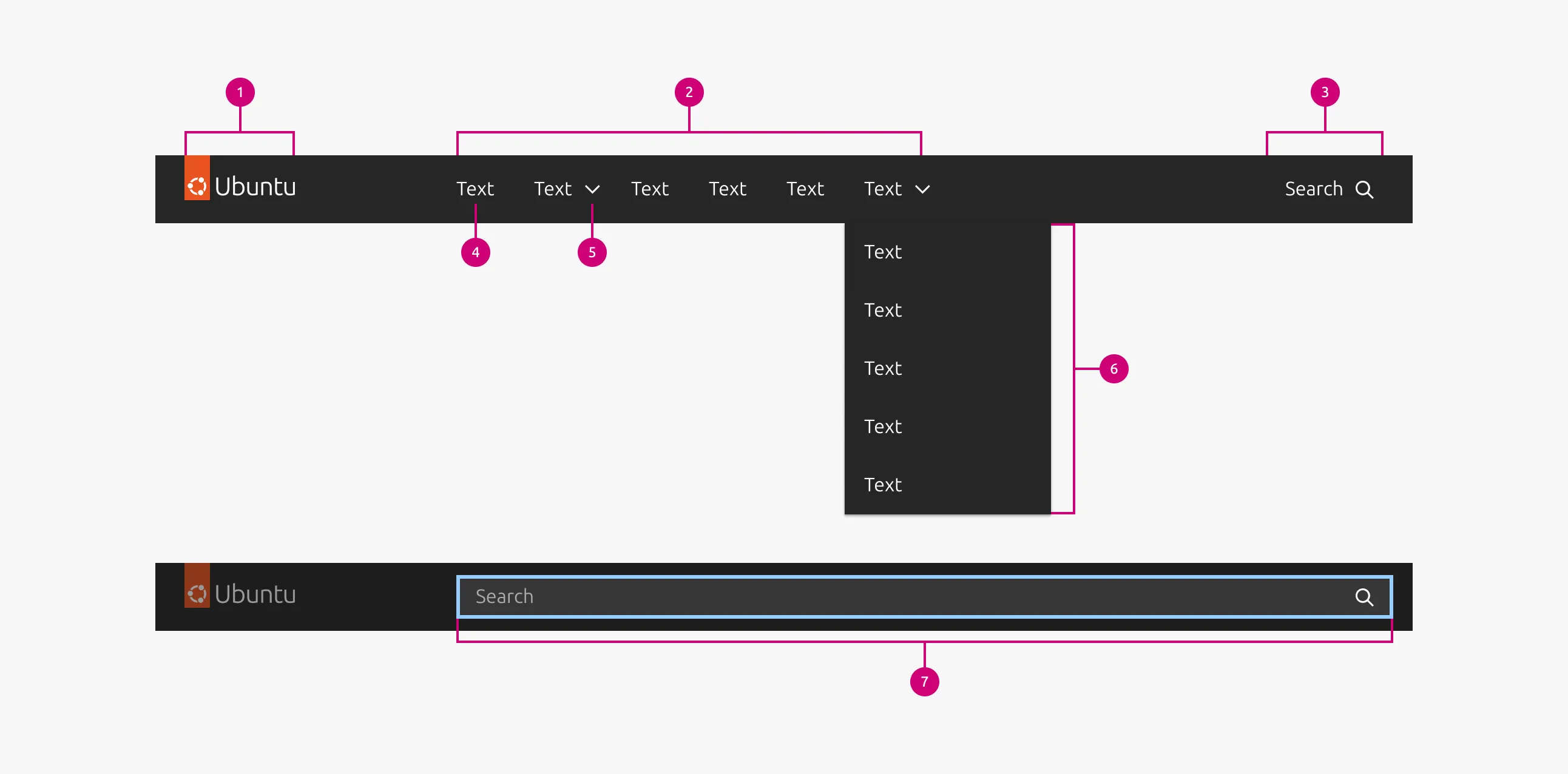
Items and grouping
Aim for about 7 items. This is not a hard rule, but it is a good target. Navigation supports one level of items plus groups. No further nesting is available beyond that.
If you have more items than comfortably fit, group related items together rather than adding more top-level items.
- A group must have at least 2 items.
- A group should not have more than 7 items.
- Items in a group need a unifying theme. It must make sense that they are grouped together.
- The group label must be meaningful. A user should have a reasonable expectation of what items they will find inside the group based on the label alone.
Logo behavior
Selecting the logo should take the user to the home page of the domain the navigation belongs to. If the navigation is on a sub-domain (for example, a documentation site within a larger brand), the logo should reflect that sub-domain, not the parent brand. Otherwise, users will expect the logo to take them to the parent site. Change the logo to indicate where the user actually is.
Optional features
Navigation can optionally include search. The scope of the search is the entire site that the navigation serves, and search results appear on a separate page.
Navigation can also include a sign-in button that forwards the user to a sign-in page. Once signed in, the navigation can show a group of account-related items, including log out.
Full-width and grid-aligned variants
Navigation comes in two variants: full-width and grid-aligned.
- Do not mix full-width and grid-aligned navigation on the same domain.
- Grid-aligned is the default choice for most cases.
Interactions
Active state
The currently active page is indicated with an underline on its navigation item. When the active page is inside a group, both the group and the item within it show an active state. When a user opens or closes a group without navigating, the group shows an active background color. It does not show the underline that indicates the currently active page.
Properties
| Name | Type | Required | Description | Constraint | Options | Default option |
|---|---|---|---|---|---|---|
| Logo | single select | Yes | The relevant logo for the site | - | Canonical product logos | - |
| Navigation items | slot | Yes | The pages to include in the navigation | At least one. Must be either a navigation item or a group. | - | - |
| Navigation item text | string | Yes | The label indicating the contents of the page it navigates to. | - | - | - |
| Navigation item URL | string | Yes | The URL of the page | It must be within the domain of the site. | - | - |
| Navigation group header | string | No | The label for a group of navigation items | - | - | - |
| Navigation group items | slot | No | The navigation items included in a group | Minimum 2, maximum | - | - |
Change log
| Who | When | What |
|---|---|---|
| Maximilian Blazek | 21.11.2025 | Initial commit |