
Button
Buttons trigger actions within an interface, typically involving data transformation or manipulation. They provide clear visual indicators of the primary actions users can perform on a page or section.
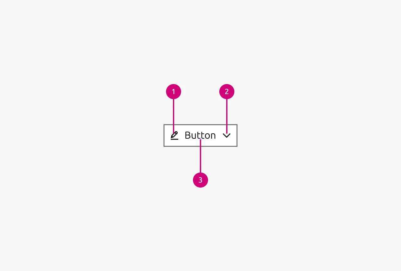
Anatomy
Usage
When to use
- For actions that transform, submit, or manipulate data
- To draw attention to the most important action on a page or section
- For high-priority conversion points or key user journeys (for example as a link in the Hero section of a marketing site)
- When the interaction represents a meaningful state change in the application
When not to use
- For simple navigation between pages. Use Link instead.
- When a primary button is already visible in the current viewport. Consider secondary or tertiary button styles instead.
- For multiple competing actions of equal importance. Reconsider your information architecture and prioritize one clear primary action.
Calls to action
Most pages have one action that matters most. Guide users toward the main action in the flow you have designed. Be opinionated about what the user should do next, and use that action as the primary call to action (CTA). Rather than offering an overwhelming array of choices, signal the intended path forward clearly. In most cases, represent the main action on a page with a primary button.
Be deliberate about the number of CTAs you present. Each extra CTA dilutes the user’s focus and makes it harder to decide what to do. Limit pages to as few CTAs as possible so the intended path stays obvious. As a rule of thumb, avoid showing more than one primary button in the user’s viewport at a time.
When multiple primary buttons compete for attention, the hierarchy collapses and users face decision paralysis. If you find yourself needing multiple primary actions in view, reconsider whether they are all truly primary. Some may need to be deprioritized or removed.
Button hierarchy
Each button variant signals a different level of emphasis. Choose the variant that matches the role of the action on the page.
Default
Use the default variant for secondary actions paired with a primary button. Apply it when no single action on the page should dominate. Use it when all actions share the same level of importance, or when the user may or may not choose to act.
Positive
Use the positive variant for primary calls to action. Typical examples include the main action on an app’s table page, the hero call to action on a website, and constructive actions that create something new, such as a new instance, a new machine, or a new row. It also confirms non-destructive actions, such as submitting a form or proceeding to the next step.
Negative
Use the negative variant for destructive, irreversible actions.
Brand
Use the brand variant in the same role as the positive variant, but not for constructive or additive actions. Reserve it for sites.
Base
Use the base variant for tertiary actions paired with a more prominent button, such as “Back” or “Cancel”. It holds the lowest level of emphasis, so only use it when the element is clearly a button. In practice, this means pairing it with other buttons. Icon-only buttons are often base buttons.
Combinations
Show at most one primary button, whether positive, negative, or brand, in a given view. Supplement it with default or base buttons as needed, and make sure the primary button reflects the main action you want the user to take. If all actions share the same level of importance and you do not want to direct the user to a specific one, use default buttons. Always pair base buttons with other buttons.
Button order and alignment
Right-align buttons when:
- The action moves the user forward in a flow, such as forms, wizards, or checkout
- The button appears in a modal dialog or confirmation window
- The button appears in a settings or configuration panel
- The button completes or submits something
- The position follows the natural end of task after scanning content left to right
Left-align buttons when:
- The button continues left-aligned content, such as a hero, card, or marketing block
- The action is a “Back” or “Cancel” that returns users to a previous state
- The button appears in an article page or a content-heavy context where buttons are secondary to the text
Icon buttons
When space is limited and the actions have recognizable icons, buttons may use an icon without text. Reserve icon-only buttons for very common actions such as delete, edit, or close. Always pair an icon-only button with a Tooltip that states the action clearly. Add a delay to the Tooltip so it does not interrupt the user.
When to disable buttons
You should keep buttons enabled by default so users always know how to proceed. Disable a button only when the action is clearly unavailable.
You may disable a button, but you must ensure users understand why it is disabled and how to move forward. Pair the disabled button with a Tooltip that explains why the action is unavailable.
This matters most for form submissions. Users may miss a required field in longer or more complex forms, so a disabled submit button can leave them stuck without a clear reason. If you disable the button, make the cause visible; otherwise, keep it enabled and let validation feedback guide users to the mistake.
The same applies to external constraints like permissions, plan limits, or missing prerequisites. Where you can, offer an alternative that unblocks the user. For example, if an empty state depends on a prerequisite, show the action that completes the prerequisite instead of a disabled button.
Dual buttons
Opposing actions can sometimes be combined into a single button, such as play and pause in a video player. The icon or label should reflect the action that will occur when the user presses the button. If the media is playing, show the pause icon. If it is paused, show the play icon. This aligns with user intent, because users select an action, not a status.
Text in buttons
Write button labels as a verb plus noun in sentence case, with no punctuation. Use clear, action-oriented language that names the outcome, such as "Get Ubuntu Pro" rather than a generic "Submit". When a button relates to a nearby heading, match the language so the action reads as a direct answer. For example, on a card with the heading "Would you like to save your changes?", label the button "Save changes".
Properties
| Name | Type | Required | Description | Constraint | Options | Default option |
|---|---|---|---|---|---|---|
| Type | single select | No | Type controls the semantic type of the button. | - | default, base, brand, positive, negative | default |
| State | single select | No | The state the button is currently in. | - | default, hover, active, processing, disabled | default |
| Size | single select | No | Controls the size of the button. Smaller sizes can be used in places where space is at a premium. | - | default, small, dense | default |
| Text | string | No | Determines the Text that is being displayed in the button. Either text or an icon needs to be provided. If no text is provided but an icon is it is an icon only button | - | - | - |
| Icon left | single select | No | Determines the type of icon that is shown in the button on the left side. Either the text or this icon needs to be provided. If only this icon is provided then it is an icon only button. If no icon is provided the icon is not shown | - | Available icons in Vanilla | - |
| Icon right | single select | No | Determines the type of icon that is shown in the button on the right side. While there is no restriction which icon can be shown here be aware that semantic icons should be shown on the left. For the most part only chevrons are used on this side. | - | Available icons in Vanilla | - |
Change log
| Who | When | What |
|---|---|---|
| Maximilian Blazek | 21.11.2025 | Initial commit |
| Maximilian Blazek | 13.02.2026 | Add links |
| Maximilian Blazek | 01.12.2025 | Updated button usage guidelines around number of CTAs as discussed in the panel. |
Decision log
| Where | Decision made | Link |
|---|---|---|
| App Mafia | Question: Should buttons in the forms be disabled if not all mandatory fields have been filled? Decision: Buttons should be enabled even if mandatory fields are missing. Users might not know why a button is disabled (they might have missed that there is a mandatory field, especially in longer, complexer forms). Enabling the button and “allowing” the user to fail will make it easier for them to discover their mistake (as clicking the button should highlight to the user what is still missing). | View |
| App Mafia | Question: Should we allow a user to fail to do an action? Decisions: We should prevent the failure if the system knows the user won’t be able to perform the action. For example, if we know the user won’t be able to add a new item on a page, displaying a notification and disabling the button is preferable. However, when we have an alternative action that would unblock the user, we should provide that option. For example, in an empty state that has pre-requirements, we should display the action to fulfil the pre-requisite. | View |