
Image
The Image component provides a structured way to display images within content, maintaining consistent aspect ratios, cropping, and responsive behavior across breakpoints. It also includes a highlighted variation that insulates an image from its surroundings, helping emphasize it or preventing image container from blending into the background.
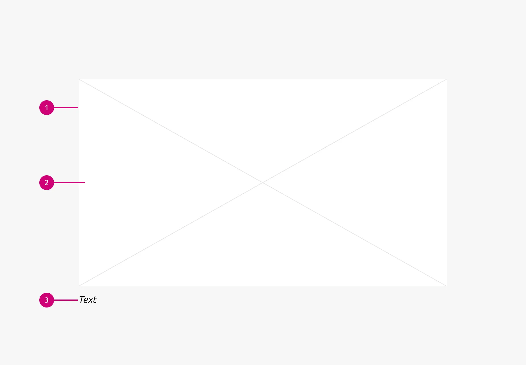
Anatomy
Usage
The Images component is most commonly used when placing content images within a page layout — for example, in articles, sections, or supporting media blocks. It ensures images maintain a defined aspect ratio, crop predictably, and respond correctly across breakpoints, preventing layout shifts, awkward scaling, or misaligned images within structured content.
When to use
- When placing content images within a page layout
- It needs to fit within a structured layout with consistent spacing and alignment
- It must adapt across breakpoints, including cropping or ratio changes
When not to use
- To display repeated logo assets in a grid — use Logo block
- To place icons for UI indicators, actions, or small symbolic visuals, use an icon component or a Button instead.
- To place an image that contains a link within it — use the appropriate higher-level pattern, even if it uses this component internally
- To present any type of textual information. Text inside images is not accessible.
Aspect ratios
Use consistent ratios within a section to maintain visual rhythm (e.g. 16:9, 3:2, 1:1). Avoid mixing ratios without a clear reason.
Highlighted background
Apply highlighted background when an image needs visual separation from its background — especially when white or low-contrast images risk blending into the page.
Properties
| Name | Type | Required | Description | Constraint | Options | Default option |
|---|---|---|---|---|---|---|
| Image | slot | No | The container for placing visual content such as images, illustrations, or diagrams. | - | - | - |
| Image aspect ratio | single select | No | Indicate ratio of the image | - | default, 16:9, 3:2, square, cinematic | default |
| Image caption | string | No | Optional HTML caption below the image | - | - | - |
| Image responsive aspect ratio | multi select | No | Change the aspect ratio of an image container, depending on the screen size | - | 16:9, 3:2, 2:3, cinematic, square on large, on medium, on small | - |
| Highlighted background | boolean | No | - | - | true, false | false |
| Object fit | single select | No | Defines how the image fill its container | - | cover, contain | contain |
Change log
| Who | When | What |
|---|---|---|
| Isaac Kim | 27.04.2026 | Initial commit |