
Logo block
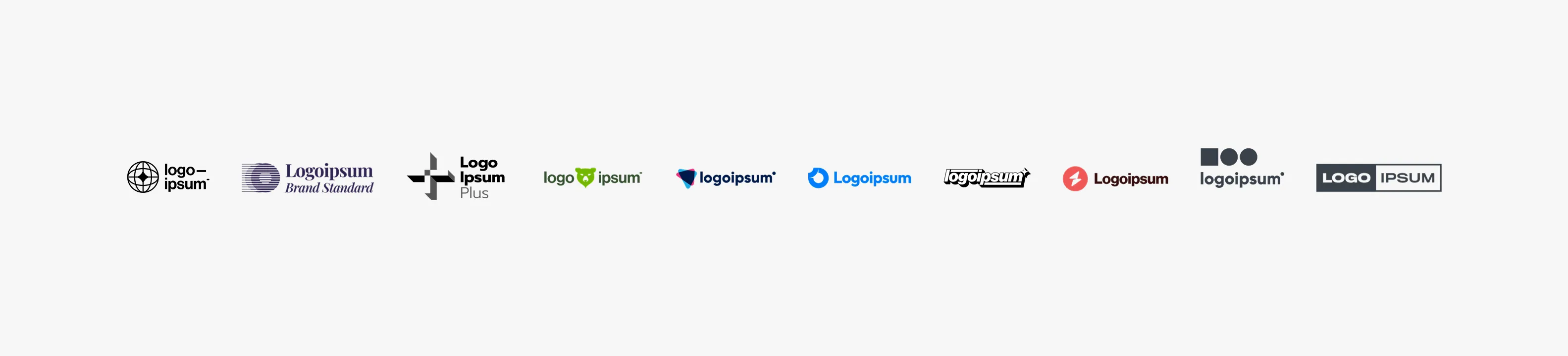
The logo block is a content unit that showcases a group of related images, such as a group of customer or partner logos. For best results, ensure that the images have identical dimensions. This block is used as the primary content unit in the Logo section.
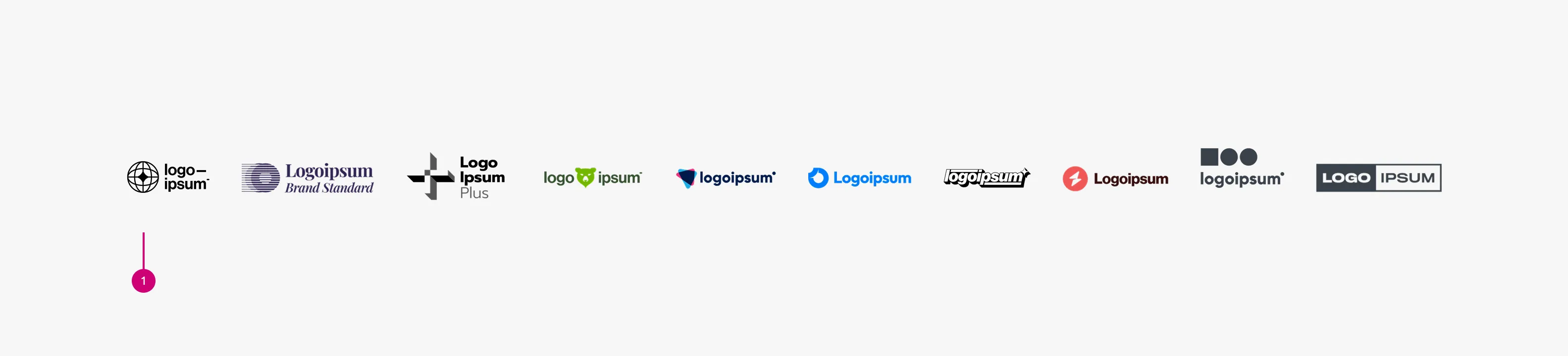
Anatomy
Usage
The Logo block is the primary content element of the . It can also be used as a block item within the , , and .
The block width follows the content container of its parent pattern, with options of 50, 75, and full-width.
Choose the appropriate logotype
When both horizontal and vertical logo layouts are available, use the horizontal version by default. However, if the horizontal version appears significantly wider than other logos or is not available, the vertical version may be used. Logos are displayed as images only, so avoid using a standalone logomark.
Each logo sits inside a fixed-height container that defines its visual bounds and ensures consistent alignment. The width adapts to the logo's proportions.
Logotype area: When a logo consists of a logotype and an optional logomark, use the logotype area as the primary reference for placement. This area is defined based on a single line of the logotype.
Logotypes should be scaled to a consistent reference height. Because logo proportions vary, the reference height should be adjusted iteratively until most logos fit comfortably within the bounding box. The longest logotype should not automatically define this height, as it may cause other logos to appear too small. Instead, select a reference height that works for the majority of logos.
If the logotype spans two or more lines, it is centre-aligned within the logotype area.
When a logo has relatively high or low visual density, optical size adjustments can be made to maintain balance when displayed with other logos.
When a wordmark is particularly long or short, optical size adjustments can be made to maintain balance when displayed with other logos.
Logomark area: When a logo symbol is used on its own, or when the logo is contained within a shape, use the logomark area as the reference for placement.
Most logo shapes generally fall into three categories: elongated rectangles (such as the examples above), circles, and squares.
Achieving precisely the same surface area is often not sufficient to create visual balance. Because logos vary in shape, color and visual density, optical adjustments may be required when displaying them together. Perceived visual weight is influenced by surface area, shape thickness, color value (darker logos often appear heavier), and internal negative space.
Based on these factors, the approximate guidelines below can be used as a reference.
When negative space differs significantly, logos with larger internal negative space may be scaled larger, while denser logos may be adjusted slightly smaller.
When logos with similar shapes have different surface areas, the smaller one may be scaled up while the denser logo may be reduced.
Color
Use the monochrome version in dark mode.
When to use
- To display a group of related logos without individual navigation, such as a row of partner or customer logos
- Logos are purely decorative or editorial, requiring no interaction
When not to use
- When each logo needs to link to an external page or partner profile, use the instead
- If you have significantly more than 10 logos, consider splitting them across multiple blocks or reassessing the design
- Logos vary significantly in visual weight and a uniform grid would misrepresent them
Further reading
Properties
| Name | Type | Required | Description | Constraint | Options | Default option |
|---|---|---|---|---|---|---|
| Logo block | object | Yes | The logo block showcases a group of related images, such as a group of customer or partner logos. | - Avoid exceeding 10 logos - Linking individual logos is not allowed | - | - |
Change log
| Who | When | What |
|---|---|---|
| Isaac Kim | 27.02.2026 | Initial commit |