
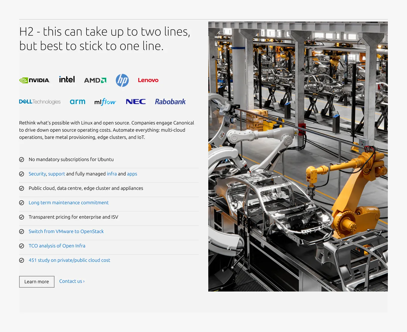
Rich vertical list
The rich vertical list is a two-column pattern that pairs a primary media with a heading and supporting content in a 50/50 layout. It's effective for presenting a single topic with an emphasized media, as well as for call-out content and adding visual variation to a page.
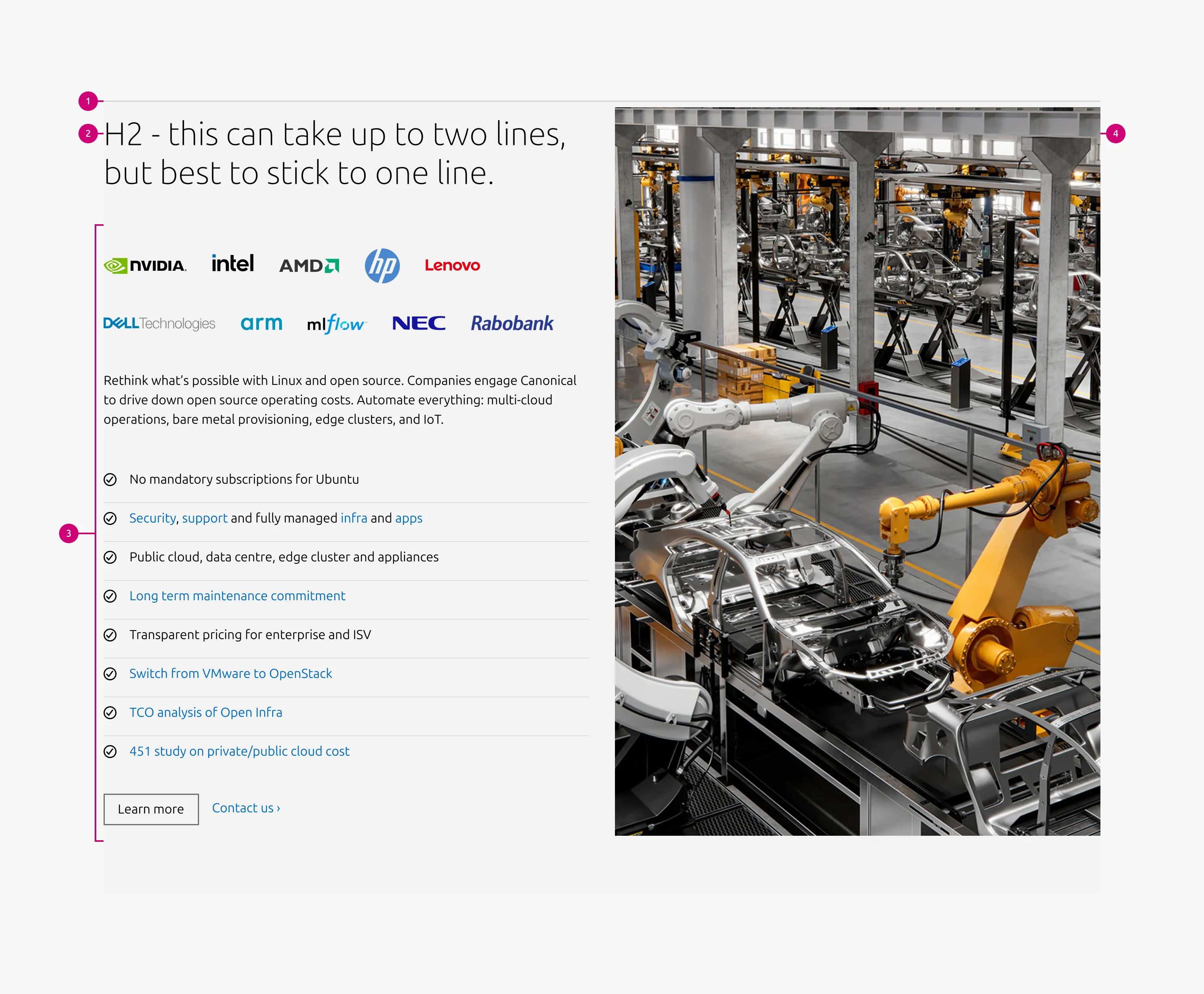
Anatomy
Usage
Use the rich vertical list when media is the primary content and all surrounding content directly supports it. It also works well as a callout section to break visual monotony, introduce a different layout rhythm, or add density to a long page.
Allowed blocks
The rich vertical list supports a subset of blocks from the basic section. Blocks that include their own image container are not supported, as they conflict with the section's primary media.
Supported blocks:
- Text
- Code
- List
- Logo block
- CTA block
Media type and fit
Media type and fit
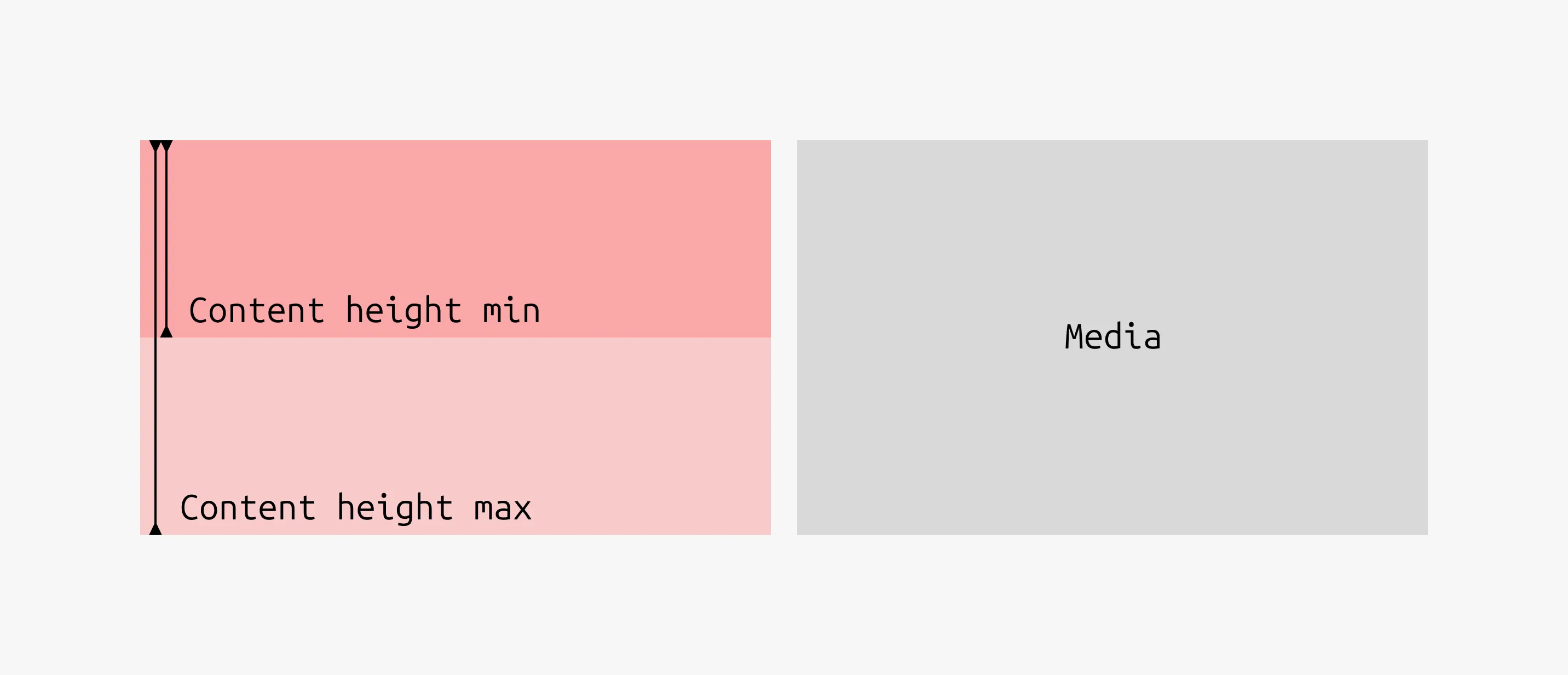
Auto height
Auto-height images adapt to the content column height within defined boundaries:
- Minimum height: equivalent to a 16:9 ratio
- Maximum height: equivalent to a 2:3 ratio
Use auto height sparingly to maintain visual consistency. Avoid it in consecutive sections. Reserve it for standalone sections or extended visual content such as infographics.
Consecutive section ratio rule
To maintain visual stability, use the same predefined media ratio across consecutive sections. Supported ratios are 16:9, 3:2, 1:1, and 2:3. The ratio may change when a new content group with a different purpose or structure begins.
Alternating layout rule
To create visual rhythm, alternate the media position between consecutive sections:
- Section 1: Content | Media
- Section 2: Media | Content
- Section 3: Content | Media
If a specific column – media or content – is the primary focus across sections, the layout may remain consistent on one side.
Content height guidelines
Keep content height balanced with media height:
- Content height should be at least half the media height
- Content height should generally not exceed the media height
For consecutive sections, the ratio of the media may be determined by the section with the longest content. In that case, other sections may contain content shorter than half the media height.
Recommended ratios by content type
- Text-focused layouts (1–2 blocks): use 16:9 or 3:2 to maintain visual balance.
- Content-rich layouts (3+ blocks): use 1:1, 2:3, or auto height, following the general layout guidelines.
Photography guidelines
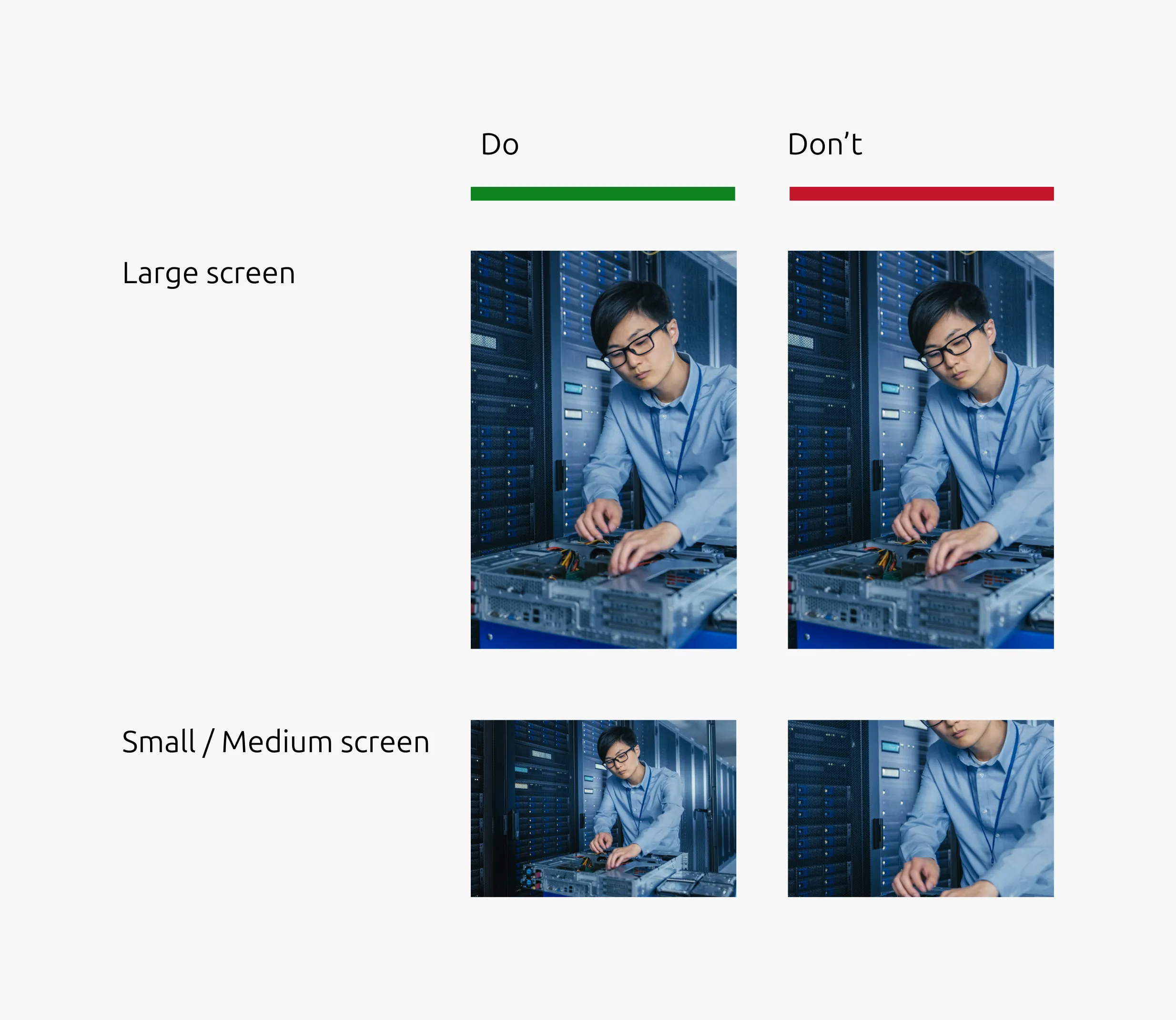
For vertical images on large screens, the image may switch to a horizontal format on smaller screens. When images include people or key subjects, ensure those elements remain visible across all aspect ratios by providing separate images for each breakpoint.
Compose assets with the cropping ratios of large, medium, and small screens in mind. Place key elements within a safe area that remains visible across all variations.
When to use
- The media is the central focus and all content directly supports it
- A section needs to stand out as a callout or highlight
- The page layout is too uniform and needs visual variation to help users stay focused
- The page is long and a denser layout would help with pacing
When not to use
- The section covers more than one distinct topic – a single primary media creates ambiguity when the content spans multiple subjects. Use the Divided section instead.
- The pattern is already used frequently on the page – overuse disrupts the visual rhythm of the page and creates inconsistency with other pages. Introduce the Basic section to restore balance.
Examples
Photography (3:2 ratio)
Large dimension
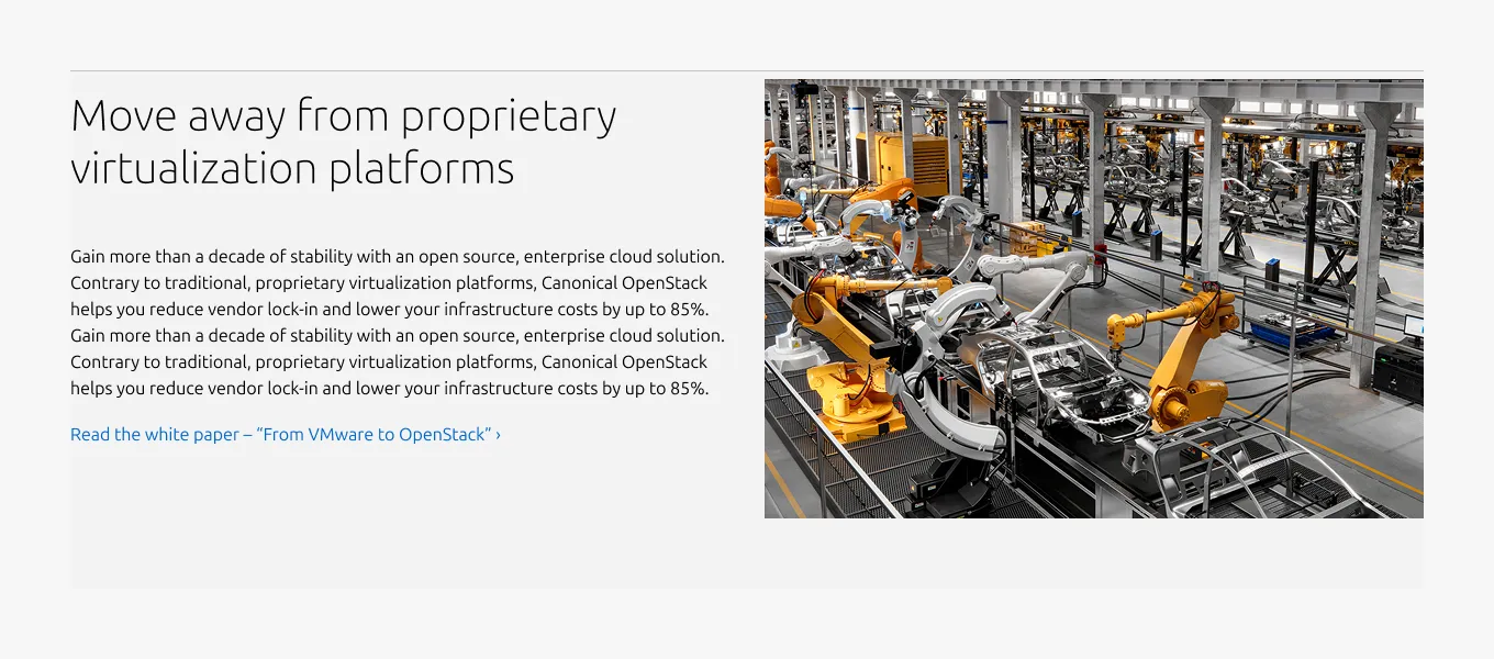
Medium dimension
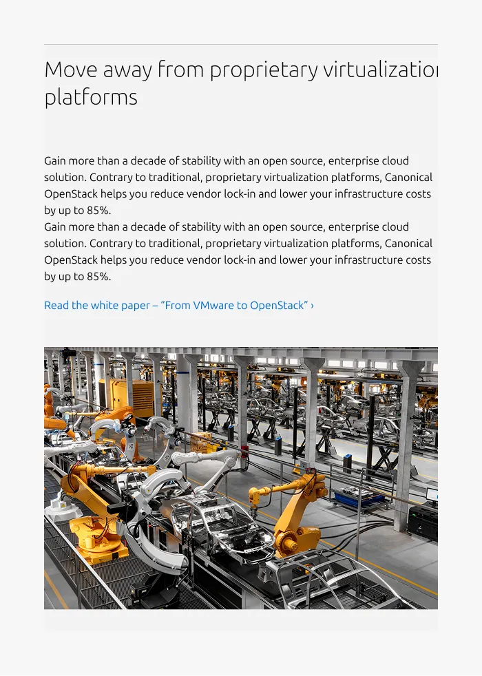
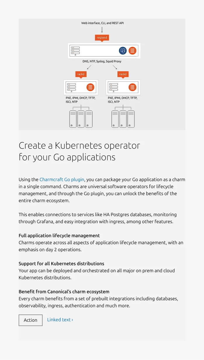
Diagram (Flipped, auto-height)
Large dimension
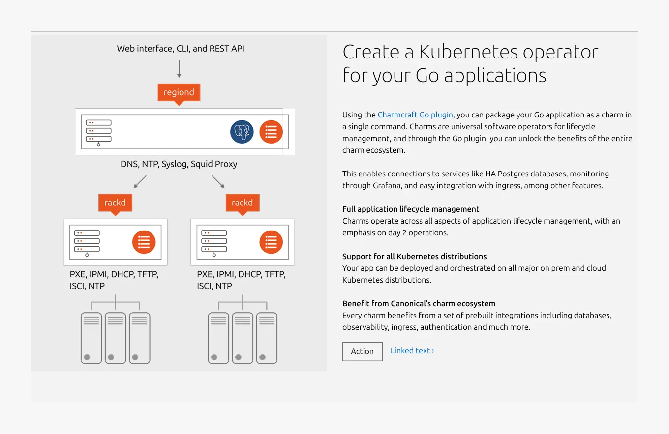
Medium dimension
Video (16:9 ratio)
Large dimension
Medium dimension
Properties
| Name | Type | Required | Description | Constraint | Options | Default option |
|---|---|---|---|---|---|---|
| Section rule | object | Yes | The rule component indicates the beginning of a new pattern | Only use the default style for the section-level rule | default | default |
| Heading | string | Yes | 4-column width heading using H2 | Up to 60 characters | - | - |
| Linked heading | single select | No | The heading may function as a link when clearly indicated. | - | none, link | none |
| Body | string | Yes | 4-column width body text | Up to 600 characters | - | - |
| Media | slot | Yes | The primary visual placed in the opposite column. Accepts image or video | - | photography, diagram / illustration, video | photography |
| Large screen media ratio | single select | Yes | The aspect ratio of the media on large screens | Consecutive sections should use the same ratio | 16:9, 3:2, 1:1, 2:3, Auto height | 3:2 |
| Medium & small screen media ratio | single select | Yes | The aspect ratio of the media on medium and small screens | - | 3:2, 16:9, 1:1 | 3:2 |
| Layout | single select | Yes | Controls which column the media appears in | - | default (content left, media right), flipped (media left, content right) | default |
| Bottom padding | single select | Yes | The type of padding applied to the bottom of the pattern | - | default, deep, shallow | default |
Child properties
Code
| Name | Type | Required | Description | Constraint | Options | Default option |
|---|---|---|---|---|---|---|
| Text | string | Yes | The code that is being shown inside of the code component. | - | - | - |
List
| Name | Type | Required | Description | Constraint | Options | Default option |
|---|---|---|---|---|---|---|
| List | slot | Yes | The grouping of multiple list items. | Minimum 2. Maximum 10 items. | - | - |
| Orientation | single select | Yes | Whether the list is displayed horizontally or vertically. | - | Vertical, horizontal. | Vertical |
| Text | string | Yes | Sets the content of the list | Up to 250 characters | - | - |
| Marker | single select | No | Decorator for a single list item. | All items in the same level of nesting must have the same marker type. No marker allowed when using dots to separate horizontal lists. | None, bullet, roman number, arabic number, alphabet letter, icon | Bullet |
| Divider (vertical list) | boolean | No | Whether has muted rule between list items | - | true, false | true |
| Divider (horizontal list) | single select | No | Whether the list has vertical line as a separator or a dot. | Dot-separated lists can’t have markers. | None, line, dot | line |
| Nesting level | number | No | Hierarchical list structures | Only vertical lists. | 1-3 | 1 |
Logo block
| Name | Type | Required | Description | Constraint | Options | Default option |
|---|---|---|---|---|---|---|
| Logo block | object | Yes | The logo block showcases a group of related images, such as a group of customer or partner logos. | - Avoid exceeding 10 logos - Linking individual logos is not allowed | - | - |
CTA block
| Name | Type | Required | Description | Constraint | Options | Default option |
|---|---|---|---|---|---|---|
| Primary CTA | string | No | The CTA used with the positive button style. It indicates a high-priority, positive action and is reserved for hero areas or other key call-to-action sections. | Up to 20 characters | - | - |
| Secondary CTA | string | No | The CTA using the default button style. It is used for most actions that are positive but not primary, and may serve as the main CTA in non-hero sections. | Up to 20 characters | - | - |
| Link CTA | string | No | The text link used for contextual actions or pathways to more information. It uses a chevron (›) to indicate navigation to additional content or pages. | Up to 60 characters | - | - |
Change log
| Who | When | What |
|---|---|---|
| Isaac Kim | 13.04.2026 | Initial commint |